

Web designers love their grids
We use them to position and align elements perfectly on the page and create neat layouts that are visually pleasing to your eyes and adapt perfectly to any size of screens (we just have to change the number of column, down to 1 col grid for mobile)
Combining grids with a CMS (to manage content) gives us super powers. Building a grid like this one below takes just seconds (literally):
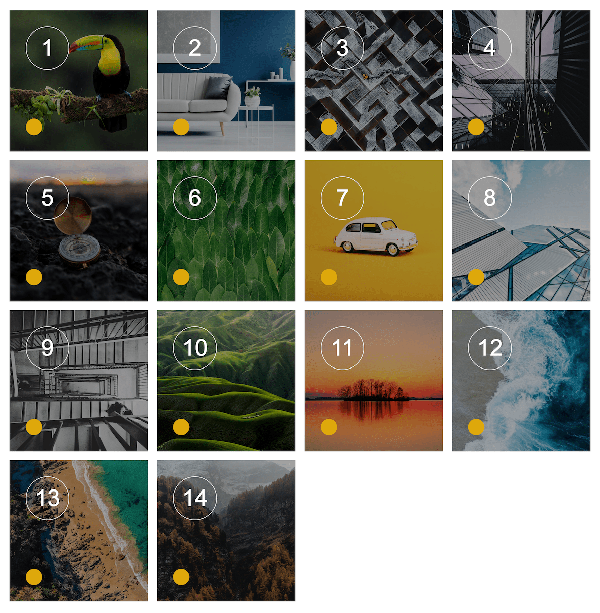
In this example, all the elements are identical squares positioned in a 4 rows / 4 columns grid. Pretty neat right?
Webflow Tip | Make perfect squares collection items in a grid
To create perfect square elements inside a grid, simply set a Top padding and Bottom padding to 50% and add image as absolute elements (after setting your square element positioning to relative)
Quick to build, fully responsive, pleasing to the eyes: we aren't we using grids everywhere? Short answer, we could but that would be like living in a world where everything is visually perfect but look always the same, without a single variations - That would get very boring and even cause anxiety and depression over time...
Grids brings structure to a page, but when you add many grids to a layout it also creates an impression of weight and clumsiness (imagine squares in squares) so the best practice is to limit them to situations where you have lots of content to organize like in a blog, a gallery (of images, products) unless... you get creative and use different grids layout like the one below
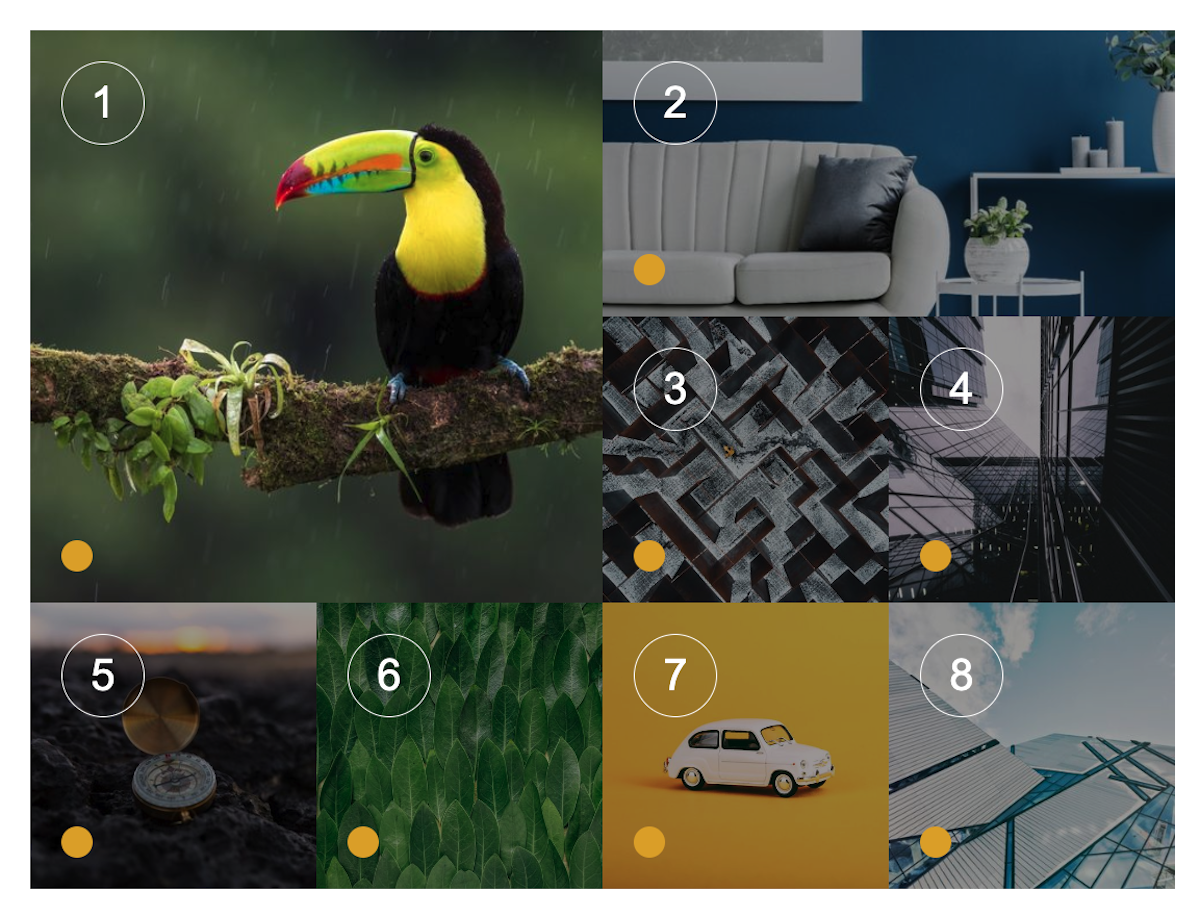
The Masonry grid
A masonry grid is a type of grid layout that is used in web design to display a dynamic and flexible grid of elements, such as images or text blocks. It is called "masonry" because it is similar to the way bricks are laid out in a wall - with each element having its own unique size and shape. Pinterest has built its famous image sharing website based on this layout
Elements in a masonry grid have one fixed dimension (identical for all of them, can be width or height) while the other dimension is left free. In the example below, all images have the same width (constraint) while their height is their original one (no additional styling is applied)
Webflow Tip | How to make a Masonry grid
Building a masonry grid with Webflow is super easy when you know this trick: use the Columns setting in the Typography section:
In this example, I have simply set the number of columns to 4

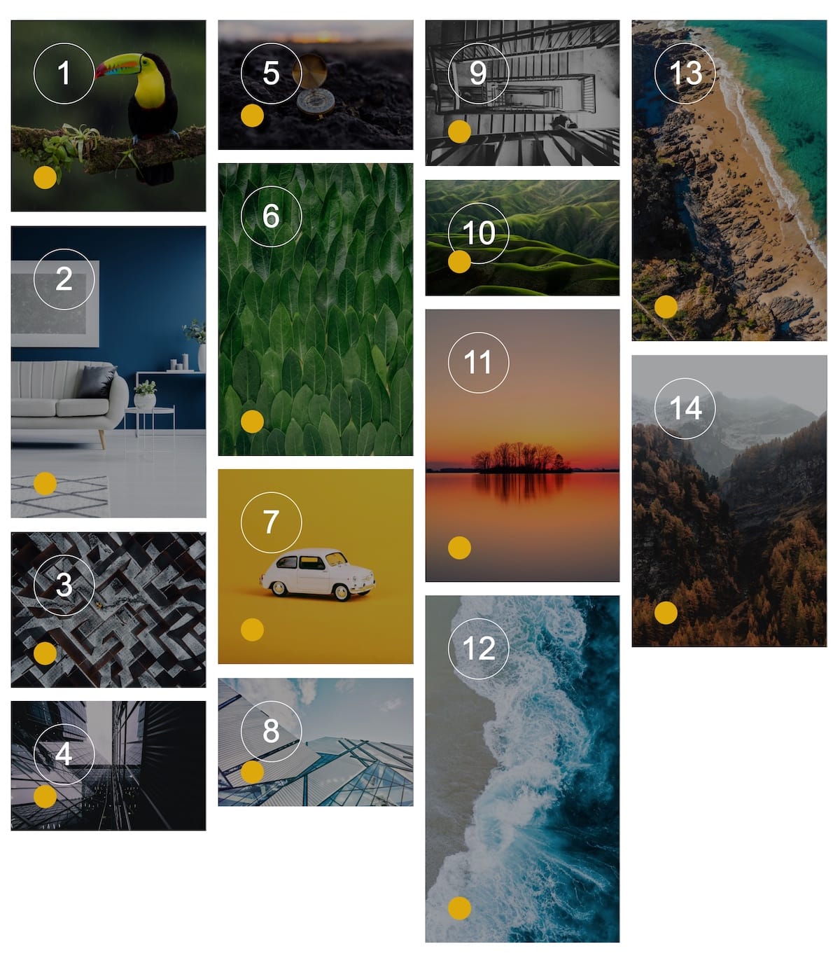
The "Alternate" grid
The alternate is a custom made layout that allows to change the width of the elements depending on their order: It is a hack to go over the usual CMS grid layout that forces you to apply the same styling to all the elements in the collection
Webflow offers options to create 4 different styles for First item, Last Item, Odds items and Even item but this doesn't work in this case. The color dot indicates the items that have the same styling:
- Orange dot - Items 1, 5, 9, 13 ...
- Red dot - Items 2, 6, 10, 14...
- Green dot - Items 3, 7, 11...
- Purple dot - Items 4, 8, 12...
Webflow Tip | How to build an alternate grid 2/3-1/3
To build such kind of grid, you need to add custom css (see the code below) and set the Collection item as an Inline and Collection item wrapper as Inline block with a class to use in the custom code (mine is .item-inside-collection-item)
<style>
/* Customize every 1, 5, 8... collection item */
.collection-item:nth-child(4n+1) .item-inside-collection-item {
width: 65.17%;
margin-right:1.5%;
margin-bottom:1%;
}
/* Customize every 2, 6 , 10 ... collection item */
.collection-item:nth-child(4n+2) .item-inside-collection-item {
width: 33.33%;
margin-bottom:1%;
}
/* Customize every 3, 7, 11 collection item*/
.collection-item:nth-child(4n+3) .item-inside-collection-item {
width: 33.33%;
margin-bottom:1%;
}
/* Customize every 4, 8, 12 collection item */
.collection-item:nth-child(4n+4) .item-inside-collection-item {
width: 65.17%;
margin-left: 1.5%;
margin-bottom:1%;
}
</style>
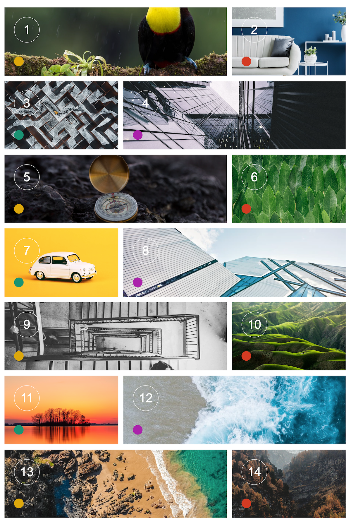
The "Ultimate" grid
This layout offers the ultimate flexibility with a limitation: you have to use a different CMS collection instance for each different styling
In this example, I am using 4 collections instance all linked to the same collection:
- Collection 1 / Size 2x2 / Limit items to 1 + Start at 1
- Collection 2 / Size 2x1 / Limit items to 1 + Start at 2
- Collection 3 / Grid 2x1 / Limit items to 2 + Start at 3
- Collection 4 / Grid 4x1 / Limit items to 4 + Start at 5
Webflow Tip | How to build custom grids with various cell sizes
For a step by step guide to build such grids, refer to this excellent tutorial


